FEED
The Art of FEED
This section of the FEED devlog will discuss the artistic process and strategy of the game -- written by Alicia Justice, artist of FEED.
Introduction
As Jacob mentioned in our FEED - Concept to Final Product post, this year’s Learn You a Game Jam has been my very first experience doing art for a game. I grew up with a love for drawing and creating, and even went on to study Art and Art History in college. Despite that, beyond working on small pencil or digital drawings here and there (and one mural!), I hadn’t made time for myself to continue to explore art since graduating college, particularly in mediums that I hadn’t already been exposed to - like game design. So this game jam has been a great opportunity to that!
Even before learning the theme for this year's game jam, I knew the two main skills I’d be learning over the course of our project would be animation and pixel art. Beyond making mini flip-books or messing around on Flipnote Studio on my Nintendo DS as a kid, I’ve never really explored animation before and was honestly really intimidated by the concept. I had even less prior knowledge of pixel art, but always thought it looked really fun - which is what led me to choose it as the medium for FEED.
In addition to the two skills I’d chosen to learn for this game jam, I also had to learn - on the fly - what creating art for a video game actually entails. Below I’ll discuss the artistic process behind FEED, as well as my experience learning these new skills.
Day 0
Brainstorming
We spent the evening of day 0 sitting down together and creating our Game Design Document. Something really beneficial for me in terms of developing a plan was getting the story of FEED solidified. Visualizing (in pictures and words) our setting, time period and the overall vibes early on created a strong foundation for me to work off of. We envisioned our main character, Mama, as a “bear-type monster with no arms”. The game would take place in some type of woodsy village (which we decided “off-paper” would be medieval), surrounded by a dark forest and the game as a whole would be dark and moody in grayscale with accents of red and orange.
Something else I found really helpful early on was working with Jacob to make a checklist of all the assets I would likely need to draw. Naturally, with this being my first time working on a game ever and this being the biggest project Jacob had ever worked on with an artist, my checklist grew daily with new assets we hadn’t thought of initially. Even so, having the list definitely helped, especially when it came to time management and task prioritization.
Resprite
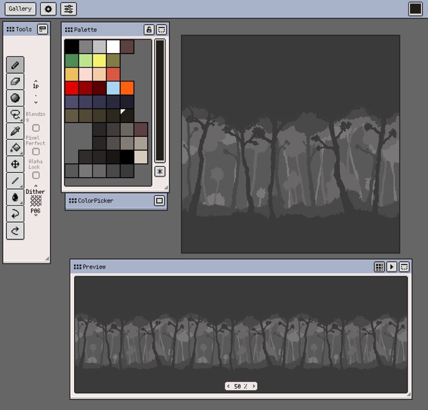
Being so new to pixel art, my first main task was finding a pixel art application to use. I would be working on iPad for this project, so I looked through some recommendations on the /r/PixelArt and /r/gamedev subreddits and settled on an app called Resprite: pixel art studio. It was free to download from the App Store but I believe I did end up paying a couple euros in-app for a slightly upgraded version.
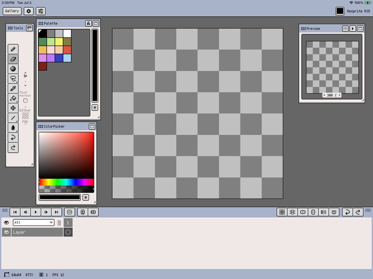
Resprite is a great app for beginners - I found it super easy to learn and interact with. I could see users with a super limited prior knowledge of digital art having a little bit of a learning curve, but I had enough experience with Procreate, which I feel functions in a pretty similar way, that Resprite was pretty simple to work in right out of the gate. The menus are easily accessible and the features are easily usable, such as adding/interacting with layers, color palette/picker, various drawing tools, as well as adding/interacting with animation frames/clips (which were features I hadn’t tried before and yet were very easy to get the hang of). I only had two main issues with this app. Firstly, the ColorPicker window (when in “Tab Sliders” display mode) hides the ability to type in/find hex codes for colors if the window isn’t large enough - something I wish I would have found much earlier in the project (a quick google search could have given me this information when I first needed it but I figured since hex codes are typically pretty easy to find in other drawing apps, Resprite probably just didn’t have it - silly me). Secondly, I’m not sure if this is necessarily Resprite's fault, but after using it for a longer period of time the app would stop responding to input (touch or Apple Pencil) or do weird, glitchy things like draw pixels somewhere random or erase large blocks of pixels on the canvas. These problems could usually be fixed just by clicking the undo button, but it was annoying nonetheless. Again, I wasn’t fully able to figure out if it was an issue with Resprite or just my iPad (or a combination), as I have an older model iPad that sometimes just can’t handle being on for super long periods of time. Overall, I would highly recommend Resprite for creating pixel art, especially if you’re just getting started.
Day 1-2
Mama
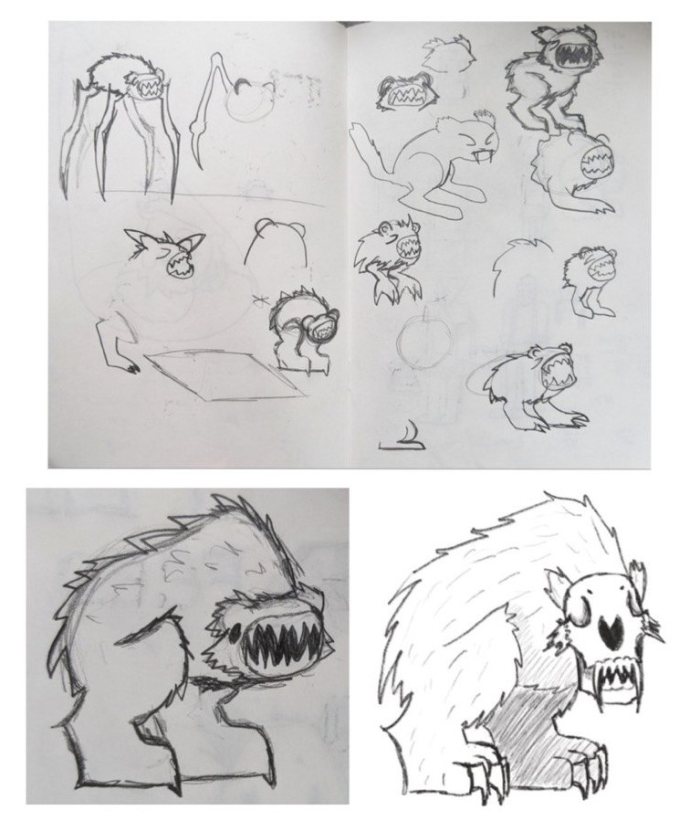
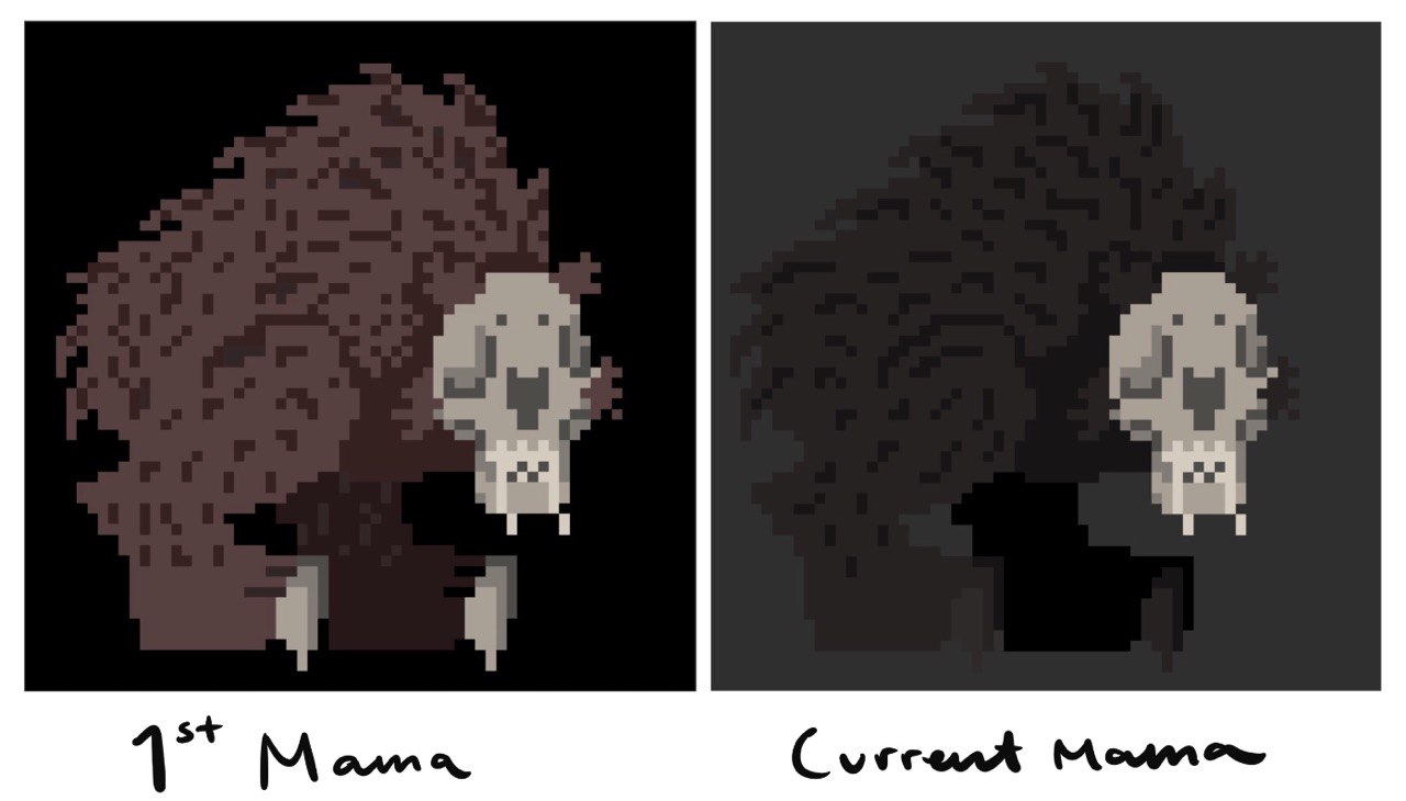
Goals & Ideas: A big question for myself on day 1 was “Where to start?”. I figured since FEED’s story and concept really depended on this “Mama” character we’d envisioned, I wanted to solidify her early on and then try to use her as guidelines for everything else. Our initial ideas and goals for Mama were a scary bear-like creature - looming, heavy and creepy. I thought about how to make Mama creepy and thought of big, gnarly teeth and sharp claws. I knew I wanted her to have a really large mouth to emphasize the idea of “feeding” - we knew she’d be carrying/eating villagers so her mouth would have to be unrealistically large - and really large mouths on characters always felt really uncanny to me. This ended up being incorporated into the Chomp action. To give Mama a lot of visual weight, I decided on giving her really big, stomping feet and also making her body sort of hunch to imply that she could get even bigger than she already is. I also wanted to keep her body fuzzy like a bear, despite settling on a skull face, to add to her bulky look.
Learning Process: There were three learning hurdles that I immediately encountered while working on Mama - determining canvas size, choosing a color scheme and reteaching myself how to draw for this new medium. Resprite has a few preset canvas sizes to choose from, but also has the option to create your own canvas size, but I really had no concept of what size would work best (both in terms of visually looking good and working well for Jacob in his part of the project). I ended up choosing a canvas size just based on a balance between being able to fill most of the canvas with the character and being able to include a decent amount of detail but still have a pretty limited amount of pixels.
For Mama’s color scheme, we had been set on a darker grayscale, but I really wanted to use slightly warmer grays to offset the cold feeling of true grays. Mama is meant to be a monster but I feel that you’re also supposed to sympathize with her after learning she’s only hunting the villagers to feed her babies. I hoped bringing those warm tones in would make Mama feel a little warmer. Getting this warm gray color scheme took a few tries though, as they still had to convey that the environment was dark. Her initial design leaned a little too far towards brown than gray and was too light for my liking, and so I had to tweak her colors a couple times before I decided on the current colors.
Lastly, something I didn’t really consider was the differences in how it would feel to draw pixel art versus traditional art. I’ve always recognized and appreciated the physicality of art - I think it's really beneficial for all artists to acknowledge what it actually feels like to hold a pencil, how they move their hand, wrist or arm to make a mark on canvas, because once you become aware of it you can start to tweak your movements to draw with more intention. The way you’d move your hand to make some type of mark traditionally wouldn’t necessarily be effective in creating the same type of mark with pixels. Pixel art also feels less about lines and (obviously) more about shapes, which I suppose is also true of traditional art but in a different way. While I would often start an asset with a “sketch” in Resprite, the sketches weren’t always as helpful when it came to actually filling in the space because I needed to consider the number of pixels in the allotted space a lot more.
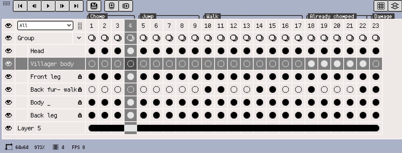
Final Product: The Mama asset uses a 64x64 px canvas and 6 layers (Head, Front Leg, Back Leg, Body, Fur, plus a layer for the villager body that she carries). She has 3 animation clips (Chomp- 4 frames, Jump- 5 frames, Walk- 8 frames), a set of 5 frames for when she’s carrying a body, and one frame for the pose she does when she takes damage.
Learning to Animate
My biggest areas of learning when it came to starting Mama’s animation were how to effectively utilize layers and figuring out how to use frames and make clips. Having used Procreate and other digital art applications like Adobe Illustrator, I understood the point of working in layers, but having never drawn something with the intention of animating it, I had to quickly figure out how to use my layers in Resprite to my advantage in an animation context. Jacob suggested looking at sprite sheets for other videogame characters to determine which parts were moving and which were static. This helped me decide on creating a layer for each leg (since they move separately from each other), the head, and the body. Villagers also received layers for each arm and weapon if they had one. This way each moving part could be manipulated separately without disturbing other parts of the drawing.
Once I had everything on separate layers, I had to figure out how to use frames which I could then group into clips to create the animations. Luckily, as mentioned, Resprite is super easy to learn and has one nice little button to add new frames (I believe this button didn’t show by default but it was easy to find in the settings), and the intuitive ability to double tap to see the frame options, such as “New Clip”. In hindsight, watching a tutorial would have allowed me to learn some helpful shortcuts ahead of time, but even without looking up any help I was able to figure out how it worked pretty quickly. Something that was challenging was making sure everything aligned from frame to frame - there might be a stray pixel here or there or maybe Mama's back leg ended up a pixel higher in frame 1 than frame 5 even though they should be the same. Something I hadn’t thought of ahead of time was deciding how many frames to use in a single animation cycle - which I also used existing sprite sheets to assist with. Most of my animations had somewhere from 4 to 8 frames, which I think was successful in the end.

Day 3-4
Villagers
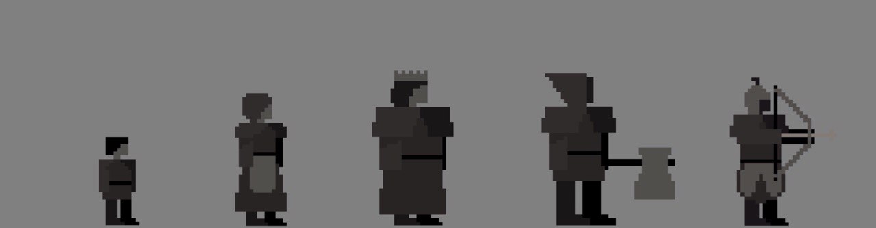
Goals & Ideas: My initial plan for the villagers was to make one super simple human design that I could put different clothes on and scale up or down as needed. To maintain my goal of having Mama be our stand out character, the villagers needed to be plain and much less detailed than Mama, but still have enough detail to differentiate between the different types of villager. I figured the main way I could differentiate them is by making the humans much less “organic” than Mama, and more square instead.
Learning Process: My first challenge was making Mama’s color scheme work for the villagers. I knew I wanted to use her color scheme on a majority of the assets so that the environment would feel more cohesive and connected. The villagers required a few more layers than Mama though, which meant I had to stretch her already limited color palette between more layers and a very minimal amount of detail. With Mama, I was able to use shadows a lot more liberally to differentiate between layers that might use the same color on top of itself, but I had to problem solve a bit longer to navigate this issue with the villagers.
The other main challenge of creating the villagers was creating weapons that were animated effectively. I hadn’t looked into sprite sheets for weapon movements just because I felt I already understood the gist of the process, so I originally animated them in the same manner as the movement cycles for Mama. For the axemen, a 4 frame cycle for the axe to swing 90 degrees. This resulted in the axe moving a lot slower than I wanted it to, and so I took out the middle two frames in favor of a choppier, 2-frame cycle instead. For the archer I repeated this method, and as a result both the axemen and archer’s weapon movements appear to happen really fast, which feels more effective.
Final Product: The villager assets all use a 64x64 px canvas. The harmless villagers (child, woman, the Baron) are each 5 layers with an 8 frame walk cycle, an identical second 8 frame walk cycle with their arms up (I call it the “Run Away” cycle) and one additional frame for their “alerted” pose for when they encounter Mama. The axemen and archer each have 6 layers (same as the harmless villagers with one extra layer for their weapons) with an 8 frame walk cycle, and their weapon movement cycle as mentioned above.
Day 5
Title Screen
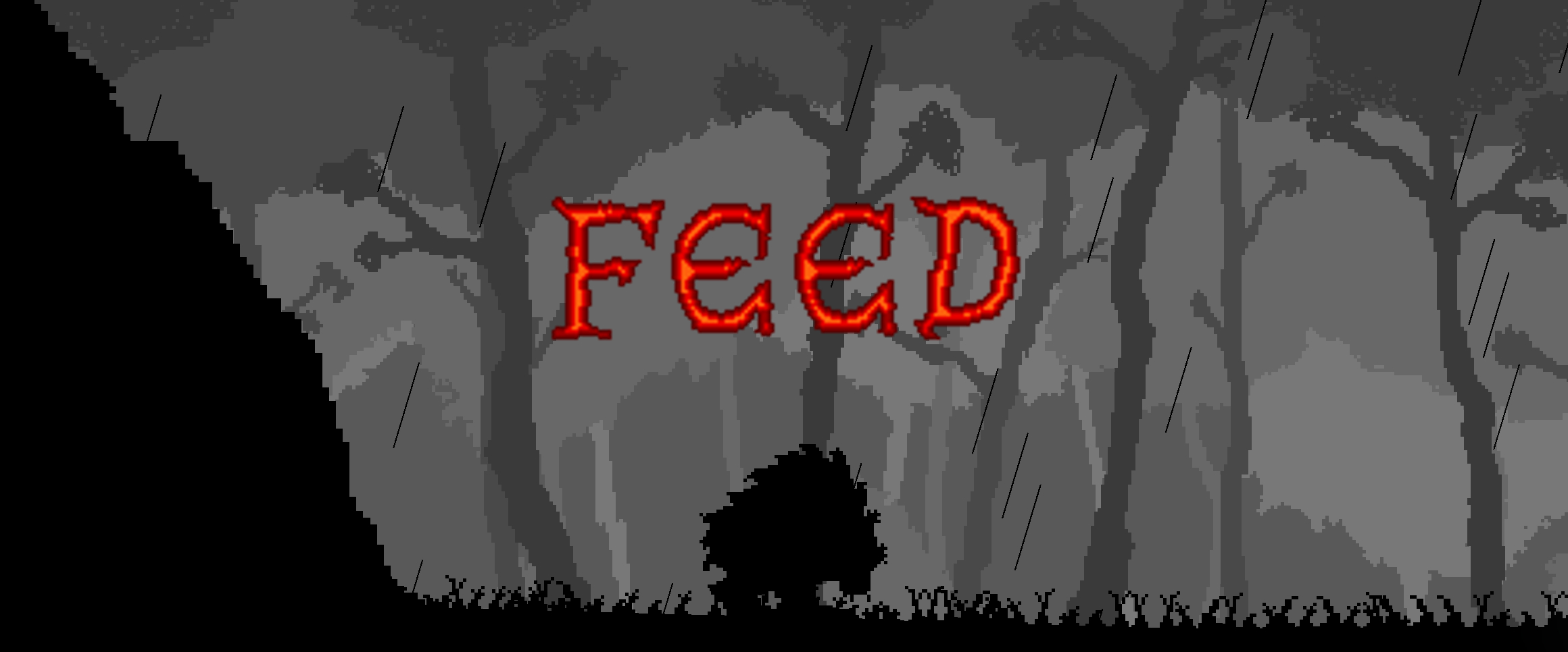
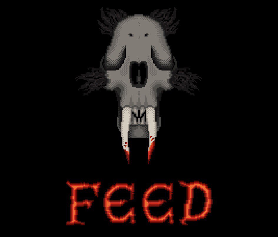
Goals & Ideas: For the title screen, Jacob actually came up with the idea to have a more detailed version of Mama’s head coming out of a dark background above the word FEED, which I really liked and decided to run with. I knew I wanted to use the title screen to start incorporating the accent colors we had chosen, and I figured the text would be the spot where it’d be the most impactful.
Learning Process: At this point in the process I’d really settled into using Resprite and was getting the hang of creating little details out of a few pixels. However, the version of Mama I had to make for the title screen was a much higher resolution than all the other assets I’d already made and I had to figure out how to make use of the larger space. Creating value on the in-game Mama just meant adding a little line of pixels here or there, but that wasn’t really working for this title screen asset. I figured I could just stack rows of offset pixels (like a checkerboard pattern) to create transition tones, which I later learned was already a pixel art drawing method called dithering! Resprite has a dithering tool as part of the pen tool options, which you can scale up or down to a value that suits your needs. Unfortunately, this was the one feature of Resprite I didn’t notice until it was a little too late (despite it being extremely easy to find), and I wasn’t able to get much use out of it.
The only other minor challenge I encountered was creating the type. I used an existing font as a reference but did all the lettering by hand, which was really only difficult when it came to spacing and alignment. I don’t think Resprite has any tools that help with text specifically, which is one thing I might like to have in the future. Otherwise, I’m really happy with the lettering and it’s honestly one of my favorite assets.
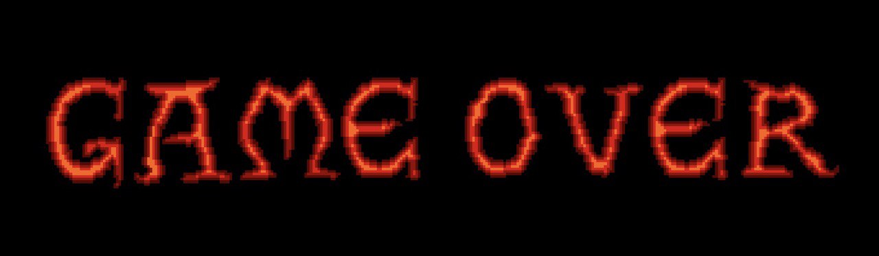
Final Product: The title screen uses a 480x270 px canvas and only uses 2 layers (Skull layer, FEED text layer). I also used this asset document to create the “GAME OVER” screen, so there is technically a third layer with just that text on it.
Health Bar
Goals & Ideas: The health bar was also a place that I knew I wanted to implement our accent colors, but beyond that I didn’t have any idea of what the health bar should look like. Jacob only requested that it look like stone, and so eventually the main inspiration for the health bar, ironically, ended up being a medieval tombstone.
Learning Process: I wasn’t sure how the health bar would work on the implementation end of the project, so with Jacob’s help we determined I’d need to create a frame for each health level possible. That way he could just plug in each version of the health bar as needed.
Final Product: The health bar asset uses a 270x270 px canvas. It uses 3 layers (stone base, dots, heart). There is one animation clip for the heartbeat (3 frames) and the health levels required an extra 11 frames (full dots to empty dots).
Day 6-7
Background
Goals & Ideas: Our priorities for the background of FEED were to have an eerie, dark forest with a parallax effect. We hadn’t used any color beyond the health bar in-game yet, and wanted to try to incorporate more color into the background.
Learning Process: Besides what I had already chosen as the color scheme for Mama and the villagers, I hadn’t really thought of a color scheme for the game in its entirety. We agreed on monochrome and grayscale, but I think I would have really benefited from establishing a complete color palette at the start of the project and then decided which assets would use which colors before beginning. We had attempted to do this but with the time constraint and having to alot more time to tasks than likely necessary for “learning buffer”, I decided just to overlook it and work on the colors as I progressed. Attempting to incorporate a color other than gray into the background at this point just wasn’t working. I didn’t want to use Mamas color scheme because I didn’t want the game play in the foreground to get lost, and making an even warmer grayscale (that had a decent range of value) resulted in really murky peachy/yellow colors. So I decided to just go with a true grayscale. I really liked this decision in the long run because it sort of enhances the warmness of Mamas color scheme, and vice versa - Mamas color scheme in the foreground makes the true grays in the back feel colder which, in my opinion, makes the forest feels eerier and also makes it appear sort of foggy.
At this point I felt I had sizing somewhat figured out but the background ended up being different because of the parallax effect we wanted it to have. Originally I thought I could just make it the screen size, like I did with the title screen, however using a parallax background requires some leeway space on every side of the screen. I made our background so that there was leeway on the top and bottom of each background layer, and so that each layer could be tiled horizontally, which would allow the background to scroll as well.
Final Product: The background asset uses a 480x480 px canvas and has 5 layers (4 layers of trees and one background layer).
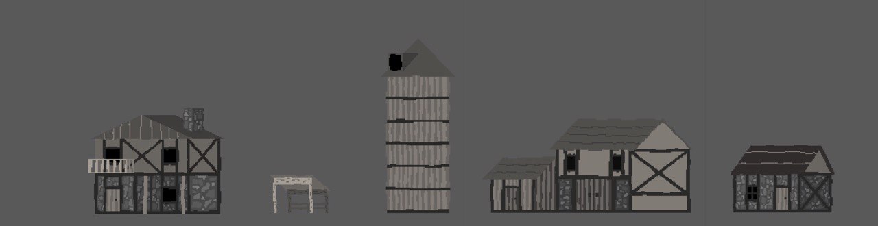
Buildings
Goals & Ideas: Since we had established our setting as a medieval village, I had a pretty good idea of what the buildings should look like. I wanted to incorporate wood and cobblestone details, as well as maintain the warmth of the characters. We briefly talked about making reusable structure tiles that Jacob could drag and drop to create buildings in Godot, however I decided on drawing whole structures instead.
Learning Process: Yet again I’d need to find a way to push the already existing color scheme so that our characters wouldn’t disappear in front of the buildings. Using the true grays of the background would have made the buildings really hard to see, but I’d already used all the darker tones of the warm gray color palette on the characters. I realized I hadn’t really incorporated the colors in Mama’s skull anywhere else, and decided to try that out on a test building. Despite my thinking that the buildings would appear too light using these colors, I feel that they fit in pretty well. The characters can be seen well enough while maintaining the “nighttime” feel (especially with the addition of the torches later on) and the buildings are able to stand out against the background.
My next challenge came in the form of adding detail. I didn’t want the structures to draw too much attention away from the characters, so instead of adding wood grain patterns or really detailed rock patterns for the cobblestone, I chose to alternate colors for wood boards and make a really simple cobblestone pattern. I wanted another way to give these buildings some life and character though, without adding much more detail. I decided that making the buildings appear kind of rickety could accomplish that and contribute to the medieval feeling.
Final Product: (Finished on Day 10) The building assets all use a 256x256 px canvas and only have 1 layer, with the exception of the one structure that has a balcony (2 layers so the characters jump up behind the balcony railing).
Torches & Lanterns
Goals & Ideas: Because the game takes place at night we knew we’d need a couple light sources, and I felt torches and lanterns worked perfectly for the medieval theme and would be easy to animate to give them a little more life.
Learning Process: I originally wanted to use our accent color palette (the colors used in the title screen text and health bar) for the fire, and in Godot, Jacob would use an orange tone for the light that it emits. However, this made the in-game environment really brown which strayed from the warm grays we were looking for. We tried using a white tone for the light instead but with the fire being so red-orange, it didn’t feel realistic. So I decided to trade in the darker reds and oranges for a new color scheme that used orange as the darkest tone and white as the lightest - that way Jacob could keep the emitted light in Godot as white.
Final Product: In order to make the torch and lantern proportional with the buildings I created them in the same document as the buildings (256x256 px canvas). Both the torch and the lantern only use one layer and 3 frames - I thought about making them 2 layers since the fire is animated but they were small enough that it was easy to make changes between frames.
Day 9
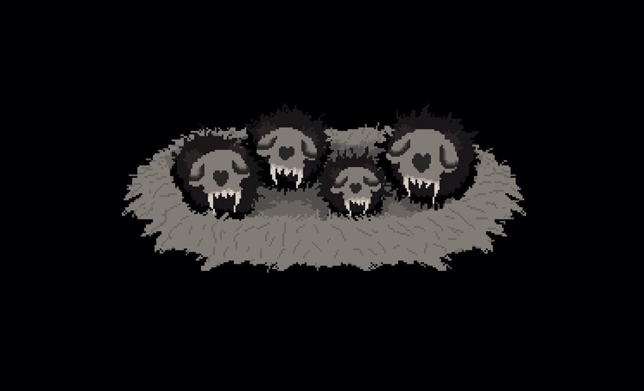
Babies
Goals & Ideas: With Mama being so large and scary, we knew we wanted to make the babies less scary and more cute. The goal was to make them round and fuzzy, and I wanted to put them in a little nest for the cave scene in between levels. I also had the goal of animating them just a little bit, but I wasn’t able to get back to it.
Learning Process: While I didn’t really learn anything new related to game design creating this asset, I do wish I had done this screen slightly differently. I think the general composition is nice, but I had decided to draw the babies and the nest in a style that was sort of halfway in between the more detailed style of the title screen and the simple style of the in-game characters. If I were going to redraw it I would do it in full detail like the title screen, or at least just spend a little more time on it. It was also at this point in the project that I started to experience some burnout from working on this project non-stop, and by the time I got to working on this asset I had a hard time putting in the same amount of effort I had the previous days.
Final Product: This asset uses a 480x270px canvas and has 7 layers (one layer for all the babies faces, 4 layers for the babies bodies (one layer each), one layer for the front of the nest, and one for the back of the nest.
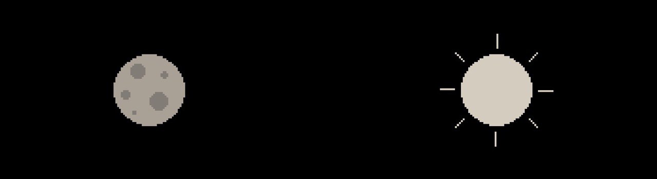
Sun & Moon
Goals & Ideas: Jacob had started to work on the babies’ screen that tracks your points and progress in between levels, and as he tested it, I recognized a need for a visual representation of time passing. This screen originally only had the babies’ asset and their hunger bar. The issue was that the hunger bar would go up just to immediately go back down with the time passing to the next night - but there was no representation of that time passing, so I figured the sun and moon would be a helpful addition. Someone also pointed out to us that it sort of looks like a mobile that you might hang above a baby's crib, particularly in the way it moves, so it unintentionally worked in that way as well.
Final Product: This asset uses a 480x270 px canvas and only has one layer. Rather than animating these myself, Jacob used Godot to rotate them around the screen. This is also a good example of an asset that wasn't planned but was added to the list later to solve a problem as the project progressed.
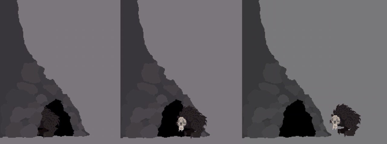
Cave
Goals & Ideas: At the end of each level Mama returns to her babies in the cave, and we wanted to add a simple cave entrance that the player can exit and enter at the beginning and end of each level, rather than just traveling off of the screen. Because the ground and background were so simple, I knew I wouldn't be able to give the cave entrance too much detail or it would stand out in a way we didn't want it to. I originally just made it the whole thing solid in the color of the ground, but I did feel it needed something to make it more interesting. I ended up using 3 of the grays from the background and adding some rocks around the cave entrance.
Learning Process: This was another asset that I had trouble balancing how much detail I could or couldn't add. I wanted to make a really detailed cliff-side cave entrance but I think it would have been too much and pulled to much focus. I felt it important to give each environment asset life without drawing too much attention away from the assets that we wanted to most attention on.
Final Product: This asset uses a 256x256 px canvas and 2 layers (one for the back half of the cave and one in front so that when Mama enters she looks like she's going inside). If the cave was more detailed I would have used the same size canvas as the background, but because it was super low detail, I knew it could be scaled up with no problem.
Grass
On this day I also made some really small grass sprites that Jacob could use for the ground. You can read his post about that here.
Day 11
Game Over Screen
Goals/Ideas: We wanted the Game Over screen for when the player loses to be super simple, no graphics other than text. I used the same reference font that I used for the title screen and freehanded "GAME OVER" using the same color scheme as the title text to keep everything consistent and make more use of the accent color palette.
Final Product: The title screen uses a 480x270 px canvas and only uses one layer.
Day 13
Win Screens
Goals & Ideas: We really wanted to see the babies again at some point in the game, and thought the win screen might be a good place for that, so the main goal for the win screen was to get Mama and the babies on screen together in some cute composition. I knew I’d continue using the text from the title screen for the text on this screen, so all my focus was on creating a good character composition. I thought the imagery of baby ducks all lined up following their mom was really cute and decided that’s what I would do with Mama and her babies. This also meant I could animate them and it’d give some more energy to the win screen. Jacob also requested that we make it possible for each of the babies and Mama to be able to wear a crown- in order to represent how many Barons the player was able to bring back to the cave over the course of their run.
Learning Process: My one big challenge while working on the win screen was figuring out how to make the babies animate in a way that lined up with Mama’s preexisting walk animation. Mama already had 8 frames of animation to work with. I couldn’t make the babies’ hop cycle a full 8 frames because that meant they only hopped once for every 2 steps Mama took. I realized I just needed to make the babies’ hop cycle a much choppier 4 frames, and then repeat it once more to align with Mama’s full 8 frames.
Final Product: This asset uses a 480x270 px canvas and has 11 layers (5 layers of crowns- one each layer, 4 layers for the babies- faces, bodies, front leg, back leg, one layer for Mama- I made a copy of her original document and merged all the layers since I didn’t need to make any changes to her, one layer for text).
Credits Portraits
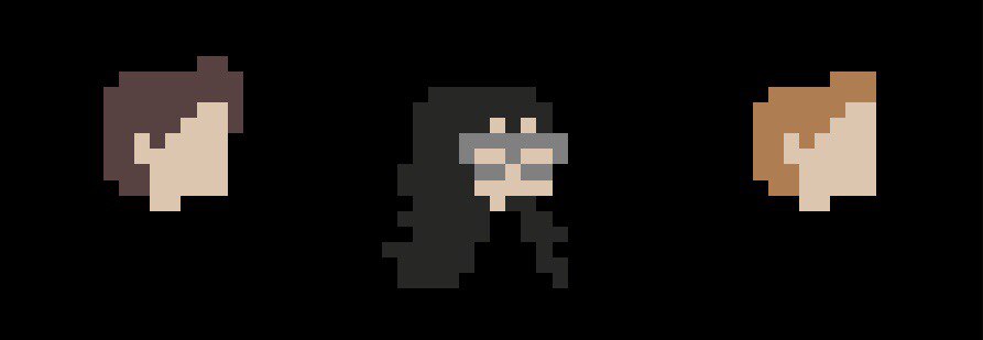
On this day I also quickly made some little pixel portraits of Jacob, Wrigley (Sound) and I for the credits screen. I thought it'd help bring a little bit of personality to the credits. (In order left to right: Jacob Justice, Alicia Justice, Wrigley Ferguson)
Conclusion
Overall I really enjoyed doing this game jam and working on FEED. Not only did I have a lot of fun learning pixel art, how to animate and exploring the process of game design from start to finish, but it was also the first time I got to work together on a project with my husband! Jacob has a lot of passion for computer science and I have a lot of passion for art so it was nice to finally be able to combine the two in such a fun way.
I would definitely like to work on another game in the future and continue to explore more digital art mediums. Learning Resprite was enjoyable and I can definitely see myself using it again - not even for game design but for my own personal work. I learned a lot over the course of this project and yet I don't even feel like I've scratched the surface.
Thank you Learn You a Game Jam for such a fun experience!
Leave a comment
Log in with itch.io to leave a comment.